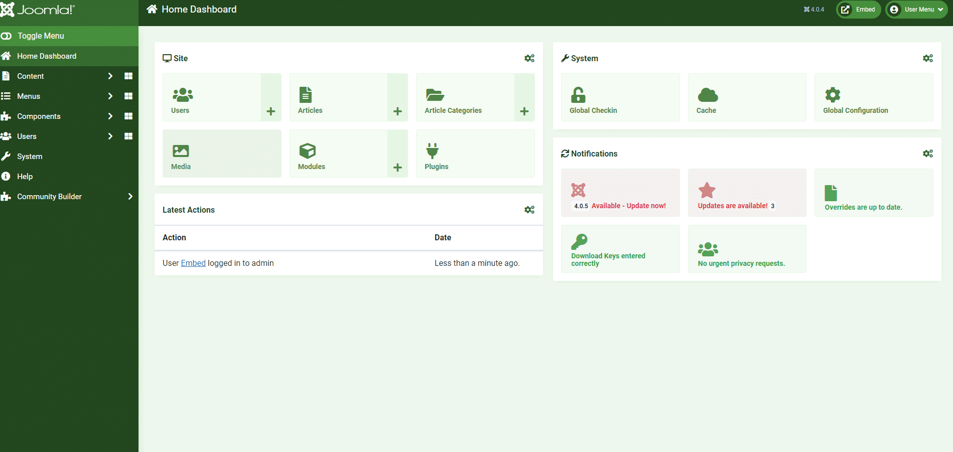
Let’s Take A Look At The New Joomla! 4 Interface: What You Can Expect and What It Means For You.
Joomla! 4 is now available and with it comes a new interface. If you’re not sure what that means or how it will impact your work, we’re here to help. Here’s what you can expect from Joomla!’s new interface and what it means for you:
1: It has a simplified design
2: It’s easier for content managers
3: You can use drag and drop functionality
4: It’s responsive
We know this is a lot to take in, but don’t worry. Check back with us soon where we’ll break down the most important changes related to each of these points.
Simplified Design
One of the first things that you may notice is that the new interface has a simplified design. Gone are the days of trying to figure out where all the menus and buttons are hidden. The new interface features a clean and uncluttered look with only the most important options on the front page.
It also features a navigation bar at the top and an Application Bar at the bottom so you can always find what you need quickly and easily.
Finally, Joomla! 4 has been designed to be responsive, meaning it will automatically adjust to your screen size for easy viewing.
Easier for Content Managers
One of the biggest changes with Joomla! 4 is how it’s easier to use. If you’ve ever struggled with uploading and inserting media or managing content, you can put those days behind you because the new interface will make things a lot easier for you.
Content managers can now use drag and drop functionality to upload images and media. Plus, the new interface has a simplified design that makes everything more clear and manageable. It’s also responsive so it’ll work on all devices.
The new interface is designed to make your life as a content manager easier. So if you’re still using Joomla!’s 3.x version, we recommend upgrading now so you can see how much easier it is to manage your site’s content!
Drag and Drop Functionality
One of the most talked-about features of Joomla!’s new interface is drag and drop functionality.
Why should you care? This will make it easier for content managers to organise their sites. Simply put, this feature allows you to rearrange pages on your website by dragging them from one place to another.
For instance, if you’re a small business with a blog and a menu page, it’s easy to move one page up or down the hierarchy to change its position without having to delete that page and recreate it in a different spot.
In fact, this is something that Joomla! has been missing since its release back in 2005. If you’ve been using Joomla! for a while now, you’ll notice a significant improvement with this update.
Responsive Interface
We know your website visitors are coming from all sorts of different devices, so it’s important that your site is responsive to any screen size.
This new interface is responsive, which means you won’t have to worry about people on mobile or tablet devices having an outdated experience. Even if their screen size is less than perfect, the content will still be readable and easy to enjoy.
It also means that people with disabilities can easily access your website. No matter what device they’re using, they’ll be able to read what you have to say without any additional changes needed.
The new Joomla! 4 interface makes sure that everyone has a great experience when they visit your website.
Overview of the new responsive interface
The interface is now responsive, so it will work on any device you use to access your site. It’s also easier for content managers to use drag-and-drop functionality.
We’ll show you how the new interface will benefit your business with this post. Keep reading to learn more about why it’s time for your business to adopt an online marketing strategy!
The Impact of the New Interface on Mobile Devices
Many people use their mobile devices to browse the internet. A responsive website is one that adapts to the size of the device it’s on and provides a pleasant experience for all users.
The new Joomla! 4 interface is 100% responsive and optimised for small screens. This means your site will look great on both desktop and mobile, no matter how someone accesses it.
Additionally, the new interface uses CSS3 media queries which allow you to customise your site according to your target audience’s browser or screen resolution. That way, you can show the best version of your website depending on what equipment they’re using.
This means that anyone who visits your site on a computer, tablet or smartphone will see an easy-to-navigate design with all of the important content at their fingertips. They’ll also be able to navigate through the site quickly and find what they need with ease.
Conclusion
Though not yet officially released, Joomla! 4 is shaping up to be a significant update. It is a return to the roots of Joomla! with a simplified design and a focus on content management. We hope that this overview of the interface has given you a good sense of what you can expect from Joomla! 4 and what it might mean for you.
The new layout of Joomla! 4 is an elegant and intuitive interface that allows for easy content management and experimentation with the responsive design. It appears that the new interface also focuses on making Joomla! accessible no matter what device you use to access it. We hope you find the new interface as exciting and useful as we do and we look forward to hearing your feedback.


